Roboto Slab Font is actually two faces of the same coin. It has a mechanical construction and the shapes are relatively simple and more geometric. However, the font contours are friendly and open, which is also important for the recognition of the brand.
Unlike other grotesks that distort their letterforms to impose a strict rhythmic structure on text, Roboto does not interfere and lets letters find their own width. This makes for a more natural reading rhythm that is more frequently seen in humanist and serif types.
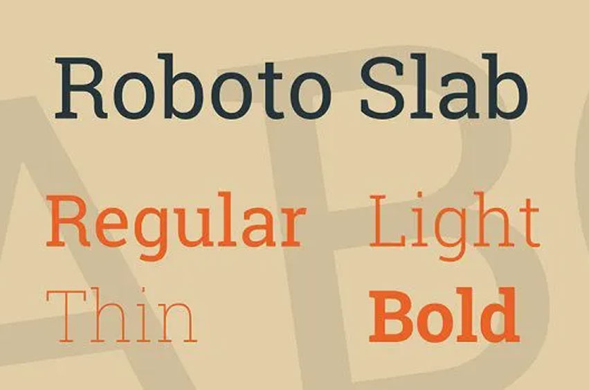
This is the Roboto Slab typeface family which is complementary to the normal Roboto typeface family and the Roboto Condensed typeface family.
Roboto Slab Font Preview

Personal use only