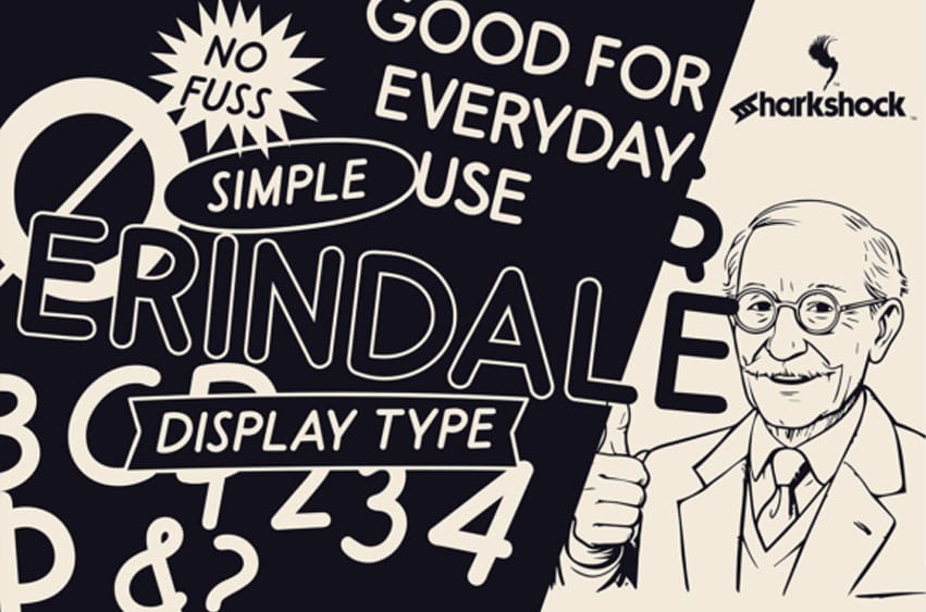
Erindale Font is an all-caps display family inspired by advertisements of the 1920s and 30s. This style of lettering was usually featured in subheadings and slogans one would find in print during this era. While the letter forms appear orderly at first glance, their alignment and spacing are slightly altered to simulate a humanistic hand-drawn appearance. The Italic versions take this a bit further with more obvious variations between letter pairs and degrees of slant.
When used as subhead text it’s clean, highly legible, and won’t steal the spotlight from the centerpiece of your project. Use it for signage, a family-friendly logo, comics, or a classic-looking poster. Try the light version for a low-contrast substitute.
Erindale is equipped with Basic and extended Latin, punctuation, and kerning, and comes in 4 versions. Please check the glyph map for all supported characters.
For Commercial Licence Click Here
Erindale Font Preview


Personal use only