Neo Sans Font Neo Tech were designed by British Type designer Sebastian “Seb” Lester for Monotype Corporation on 19 April 2004 with their design concept being an edgy yet modern font without being overbearing or garish.
This typeface first gained popularity after its customized version was chosen as the main logo character for Vancouver 2010, Olympic and Paralympic Winter Games. Since then, its use has spread throughout various organisations to brand their name or organization with an identifiable face.
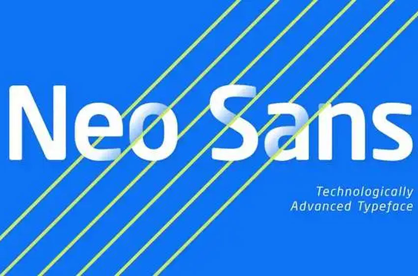
Neo Sans is a collection of fonts featuring square, round sans letters for its family of fonts ranging from ultra-light to light weights with an accompanying italic font, perfect for branding purposes and editorial or design work on magazines.
Neo Sans Font Preview


Personal use only