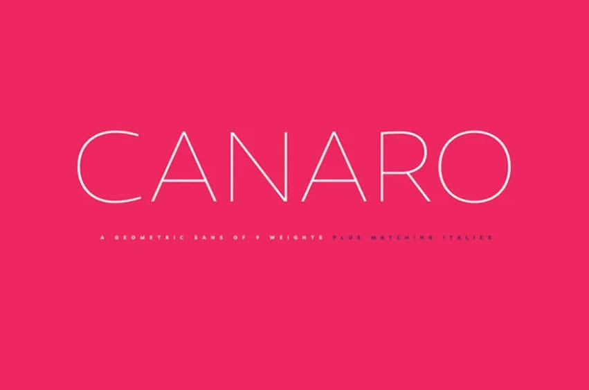
Canaro Font The designer, Rene Bieder, created Canaro Font as a geometric and modern sans font family for clear and easy reading purposes as it is extremely easy to read. I think that the sans-serif font design is very important in achieving a modern look – and that is exactly what Canaro is! Rene intended to emulate geometric type designs from early 20th century but at the same time, make his initial designs as relevant to the modern era as possible. Canaro Font was developed as part of this experimentation by borrowing elements from these designs, at least in its early developmental stage.
In the course of its evolution and strive for a more contemporary appearance, this font became a font with a rather chequered past that is notable for its readability and functionality. Besides, it doesn’t have spurs which provide an elegant yet modern touch while other typographic ornaments including alternative figures, ligatures, oldstyle numerals, arrow, fractions and special characters give it a family look.
Canaro font is available in nine weights with italic versions for each. From the thin and refined cuts, to muscular and powerful bodybuilders, Canaro offers a product that can meet every need. It is a sans serif typeface that can be used for personal purposes and can be downloaded and enjoyed. Please download it today and let yourself be inspired!


Personal use only