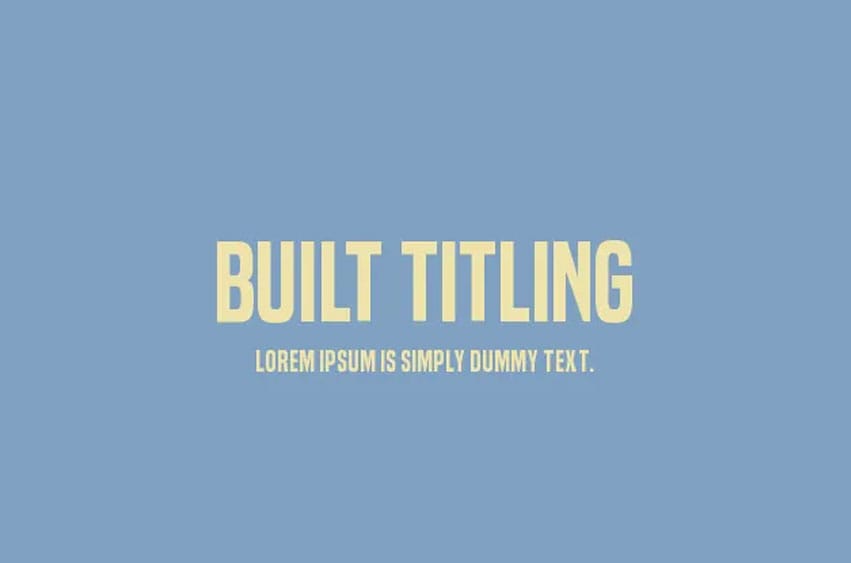
Built Titling Font Built has one job, making solid compact headlines onscreen. Designed with trust and neutrality in mind, Built’s wraparound forms speak newsy headlines in your voice. Subtle curls contrive a feeling of some different news era, without coming off particularly antiquated.
Built varies in five weights from extra-light to bold. But not like your usual thin to fat continuum. Type fonts are already restricted in how lightly they can be made. In this day and age, with all sorts of different resolutions and screens, going lighter just makes everything get bigger–a whole lot bigger. You’ll really look funny if you wind up getting splits in the ends.
Built varies in five weights from extra-light to bold. But not like your usual thin to fat continuum. Type fonts are already restricted in how lightly they can be made. In this day and age, with all sorts of different resolutions and screens, going lighter just makes everything get bigger–a whole lot bigger. You’ll really look funny if you wind up getting splits in the ends.
Built boasts fractions, primes, numeric ordinals, compact accents, Indian rupees and the Turkish lira. As it loses weight, Built’s asterisk sprouts more legs, keeping it’s presence even in Extra-Light. The punctuation is squeezed thin and has some nice loose effects on the edges, giving it cool emphasis that is more than a slant.
There is also an italic version of the extra-light version. Like the other weights, this font may be freely used for any purpose.


Personal use only